
Here is the logo they started using in 1977. Ain't he cute? Really puts the fear into you doesn't it?
 Getting cooler I think. This is the logo they started using in 1995.
 Getting cooler I think. This is the logo they started using in 1995.
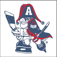
 This is the logo they started to use in 1999. Looks a little less hokey and a little more hockey. Why did they drop the stick and where are those eyes?
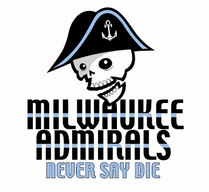 And here it is. The new logo for your 2006/07 Milwaukee Admirals. The only thing that remains is the hat, you can now see his eyes (or where his eyes would be if he weren't a skull) and we have an added treat, the Never Say Die slogan. I do not like the logo but that slogan, Never Say Die, it sure does ring a bell. Where have I heard that line before? Oh yeah!
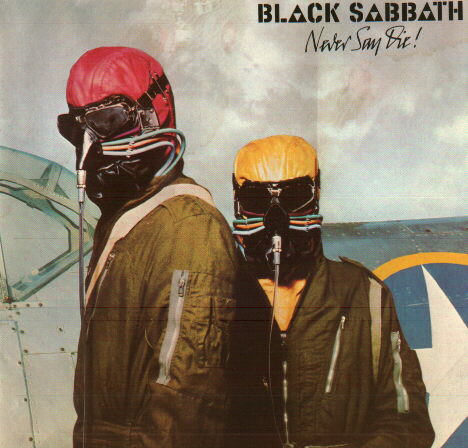
Or wait, was it here?
Here are my favorite reactions from the folks at brewerfan.net:
"Hahaha, that's great. it really screams 'minor league hockey."
Diskono
"The skull looks like something out of a Homestarrunner cartoon."
Point Beer Is Best
"That's weak. Might as well call them the Gold."
razzzorsharp
And my personal favorite,
"I don't get it. Why a skull? They're not the Milwaukee Weird Skeleton Pirate Thingies." DougJones43
No comments:
Post a Comment